
For most of the last century, a bank's brand was a building. Columns, a vault door, a brass lock: the architecture was an err to the security of money anddid the persuading. As my co-host Miles Seiden pointed out on our latest episode of No Matter, corporate identity as a discipline grew up largely inside banking, which is why so much of it still defaults to the same cues. Navy and blue, serif wordmarks, shields and pillars, all making the promise they made in the 1920s: your money is here, and it will still be here tomorrow.
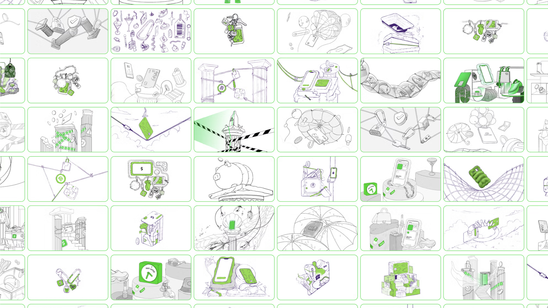
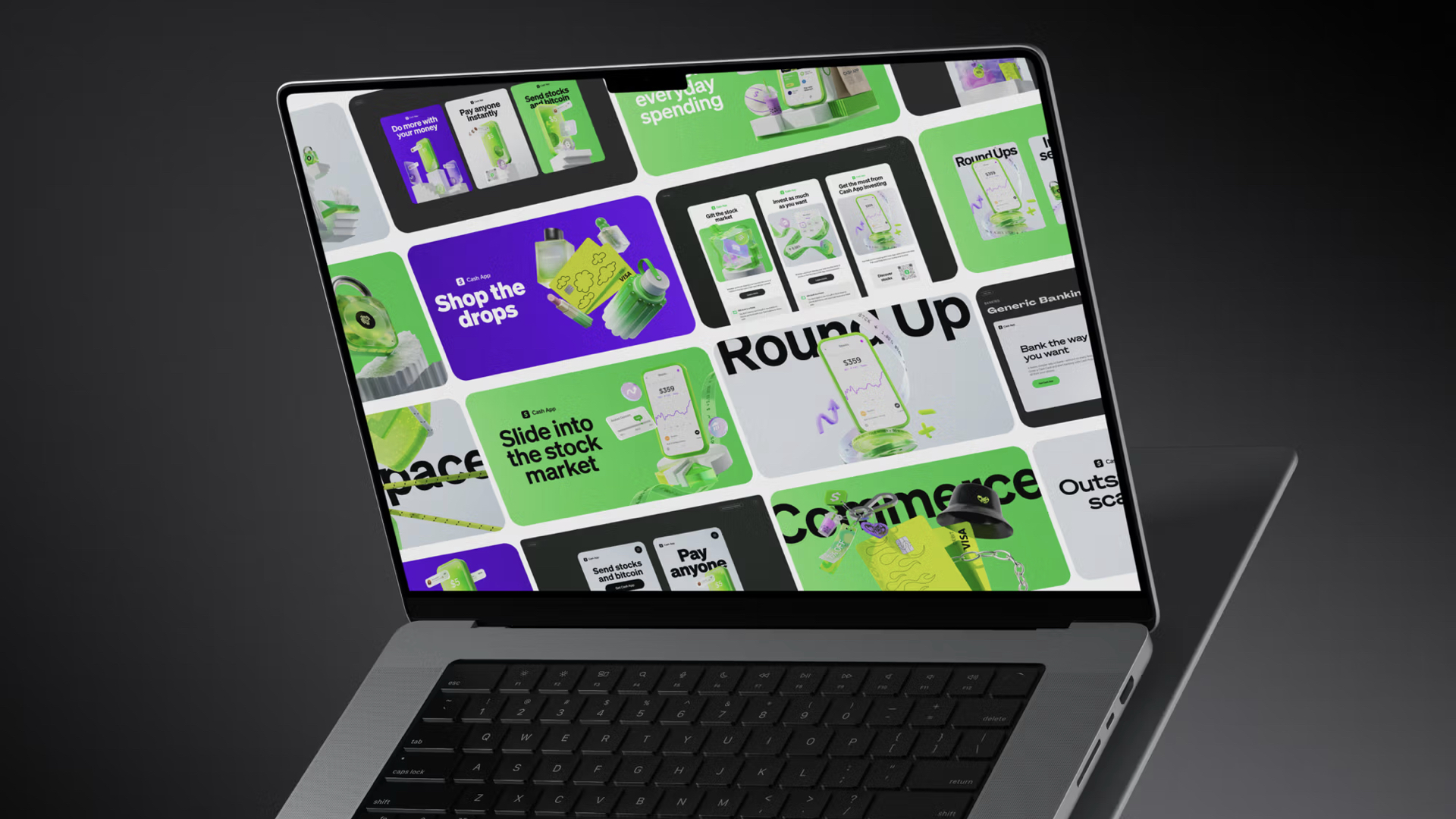
Cash App's recent brand work makes a different promise, possibly leveraging a different financial model—certainly reflecting different user goals. The 'Evergreen' design system, developed by BUCK alongside Cash App's in-house brand team across 2023 and 2024, isn't a logo change like the usual 'rebrands' we're used to seeing. The bold, italic dollar sign is untouched. What changed is the world around it: a library of 3D-rendered objects, a lighting style and environment details, and a set of rules for how a coin, a check or a padlock should look floating in space. Miles, who currently counts a large bank among his clients and has worked in fintech, put it plainly: you don't tend to look at a bank and call it exciting. This one is.
From buildings to objects
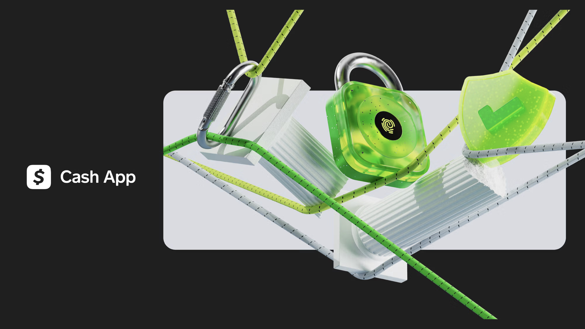
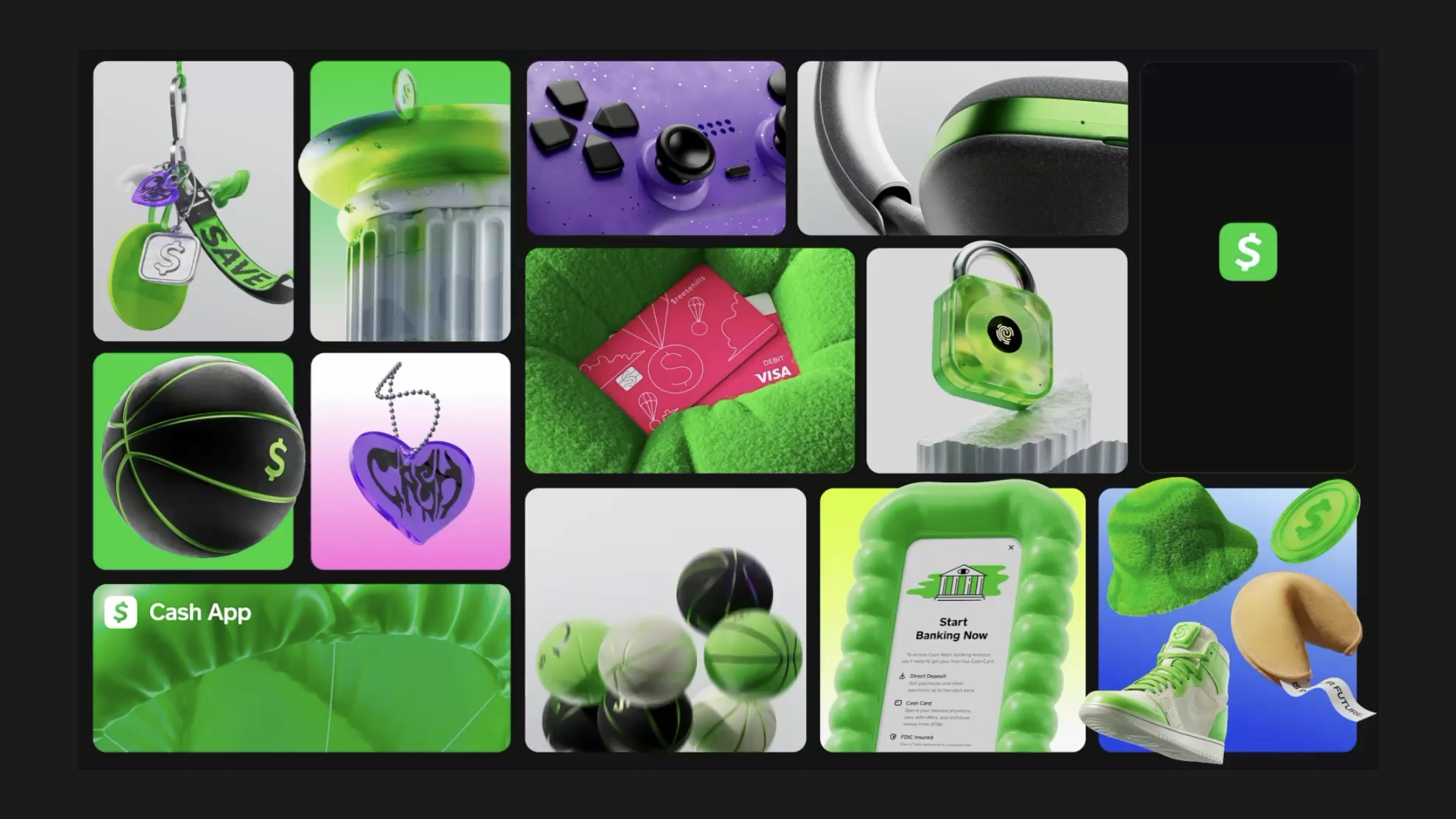
The system keeps a few heritage symbols. There is a pillar, but it's graffitied and broken (at the bottom, as if released from the 'foundation' of banking) rendered like a toy. There is a lock, but it's clear plastic, closer to a high school locker than a front door. Nobody would secure a house with it. Miles read the broken column as something close to a middle finger: a renegade gesture at the stuffy institution, delivered with a sense of humor heritage banks rarely allow themselves.
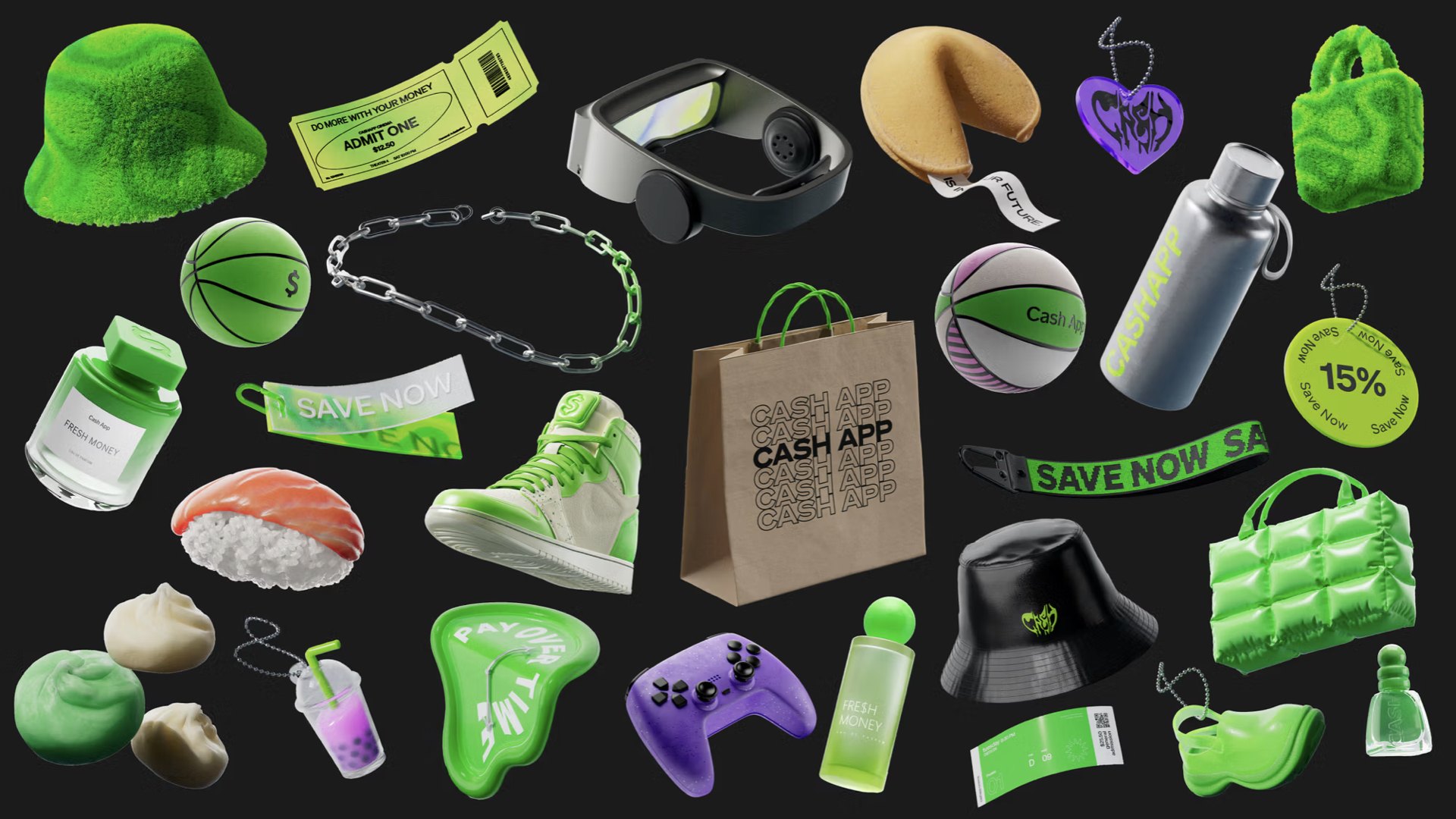
Those two objects are a small fraction of the library, and the system treats them as props from an older story. The rest of the shelf holds an off-brand basketball sneaker (obviously Nike Jordan's), a bucket hat, a water bottle, sushi, boba tea, dumplings, fortune cookies, a VR headset, a basketball and a melting clock that winks at Dalí. Everything is glossy and gummy. Even the case around the phone is bubbled and squishy.
Miles named the shift in a phrase: Cash App has moved from buildings to objects. You don't walk through columns to reach this brand; you put it on, carry it, eat it. Basically, you spend it.
Symbolism in the Keychain, not the Keys
Look at the objects again and a pattern emerges: nothing on the shelf costs more than a paycheck or two. There is no house, no car, no college fund, nothing you would have to save for. The system depicts money that arrives and leaves almost immediately, converted into status, pleasure or a night out with friends.
Several of the objects are keychains , whether lanyards or just chains, and we consider whether it was deliberate: the keychain without the keys.
It's the sharpest discovery in the episode. The heritage bank sells security while Cash App sells the thing you're about to buy.
This is also revealed in something we discovered along the away: Cash App is not a bank; it describes itself as a financial services platform, with banking services provided by partner banks. It earns heavily on movement: an interchange fee each time someone swipes a Cash App Card, a percentage fee for instant deposits, a fee when a transfer is funded by credit card. A traditional bank profits from money that sits still and gets lent out. Cash App profits from money in motion, and its brand depicts money in motion.
A brand that celebrates the next small purchase is, by design, a brand that encourages more of them. Nothing in the library suggests saving is something its users might want. That is a business decision expressed as a design system, and it's worth reading the system with that in mind.
Specific Beats Universal
It appears Cash App isn't trying to speak to everyone (call it niching). Boba and sushi are culturally specific choices, foods with Asian origins that have become a fixture of how young Americans go out. Putting them in a bank's visual vocabulary is a statement about who the brand is for, and a bet that specificity reads as recognition.
The green deserves its own note. In the United States, green has signaled money more than trust, and while Cash App's is far more electric than a dollar bill, closer to the glow of a phone than the ink on a banknote, it's still an emotional subject, and the green carries that charge: excitement and opportunity.
Built from what People Already Do
The imagery also reads as data. In his reading before we recorded, Miles found that the system extended things Cash App already knew its users were doing with the app. A library stocked with sneakers, sushi and boba looks less like a creative director's mood board and more like a transaction report rendered in 3D.
The lifestyle of this brand is really the lifestyle of its customers.
Most brand programs work in what I'd call reverse niching: define a niche first, then go hunting for the people who fit it and hope for the best. This system runs the other direction, from observed behavior outward. It doesn't tell customers who to be. It amplifies what they already do. Miles pointed out a practical benefit: when budgets are tight and creative work is expensive, anchoring a system in real behavior takes some of the fear out of bold decisions. It also explains how the system avoids the most common failure in youth marketing. The fastest way to alienate a 19-year-old is to try to be cool.
Large institutions, Miles noted, modernize too, but more slowly, because changing anything at their scale is hard. Cash App can move at the speed of its users.
Purchase Frequency is the Strategy
Frequency is why this works for Cash App when it would fail for Bank of America. You buy boba this afternoon; you buy a house once a decade, if that. A bank whose relationship with you peaks at a mortgage closing has to project permanence across years. An app that shows up every time you split a pizza has to be pleasant to open on an ordinary Tuesday, and fluent in whatever its users care about this week.
Besides, it is called "cash" "app", which is about as direct a translation as you can get. But instead of exchanging actual cash, users pay a little bit more, and Cash App pockets the difference.
Regardless, that frequency changes how people talk about money. Our parents' generation mostly didn't, unless they were peeking over the fence at the neighbors. Peer-to-peer payments turned money into a running conversation, complete with joke memos. Not everyone is comfortable with that. Miles doesn't want his friends seeing that he bought a pizza, and traces that instinct to a family that didn't discuss money. We're a generation caught between both habits. Cash App is betting on the open one, and on the younger audience that will do with it what they please.
The Branch is Now a Render Studio
Consider how short a distance this is. When I opened my first account at 17, the deciding question was geography: which bank had a branch both in Nampa, Idaho, and near my school in Chicago, 1,700 miles away. There wasn't an app I could use to access a bank wherever I was.
Two generations before that, someone like my grandfather, into his late eighties, kept checking at one branch of his bank and savings at another branch of the same bank across town, and drove between them whenever he moved money from one account to the other. For his generation, the building was the bank.
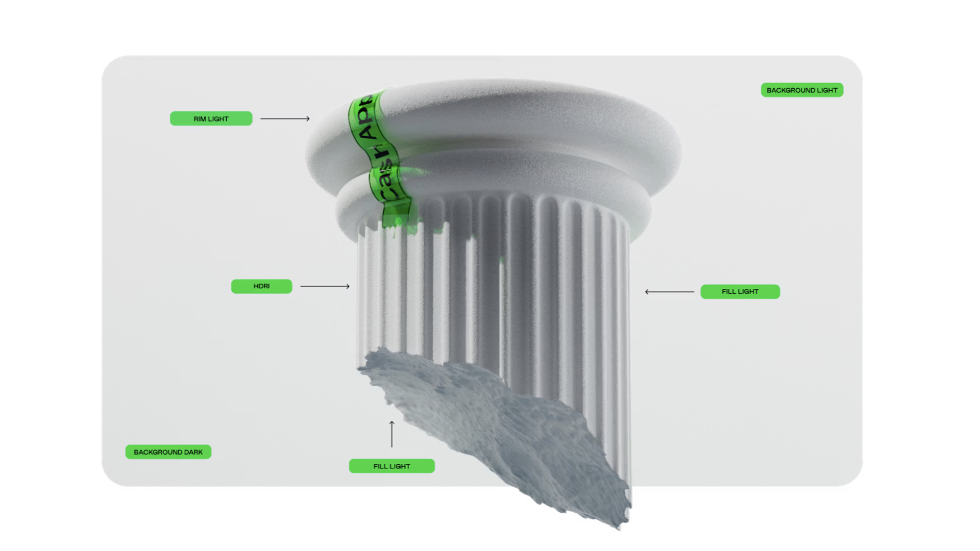
Cash App never had branches to justify, which gives it a freedom heritage institutions lack. In their place, the system defines a virtual studio. The guidelines specify a rim light, a fill light, a light from below, an HDR environment and a set of background lighting scenarios, much as a sneaker brand's product studio shoots every shoe on the same turntable under the same lights. Consistency used to come from the marble lobby. Now it comes from a lighting spec.
A generic name, a specific system
As I wrote previously, the name helps. It's "Cash App", not Bank App, and cash has always been social and tactile. It jingled in a pocket, got lost in the console, sat on a table when someone made a bet, and traded hands with much cooler handshakes than an RFID tap. Most of that disappeared when payments went digital. Miles pointed to the animations of coins and balls tossed in the air as an attempt to restore that tangibility, because brands that live only on screens tend to go flat.
He also made the case that the name and mark barely need a story. "Cash App" is about as descriptive as a name can be, and the dollar sign is a universal symbol, like using an old rotary phone as the icon for calling. There's little inherent creativity at that entry point. The system does all the work. Or, as we agreed, this brand is made or broken in its system, and this one is made.
My one real complaint is still the mark. The bold, italic dollar sign is functional and widely recognized, but it isn't ownable; any fintech could draw it. Escaping the dollar sign is probably impossible for a company named Cash App, but owning it more completely is not. A system this considered deserves a mark that carries as much of the brand's character as its fluffy handbag.
No matter
Our overall summary:
The brand system works because it's tied both to real customer behavior and to the entertainment ecosystems its audience already cares about.
We rarely hand down verdicts on this show—we're both too appreciating The market decides, and we're reverse-engineering a long, complicated process from its outputs. As Miles said, we're happy to be wrong.
Cash App understood that its users treat money less as something to protect than as something to spend, share and show, and it built a brand system for exactly that. In doing so, it makes the clear case that a financial brand no longer has to look like a building with a dusty blue binder.