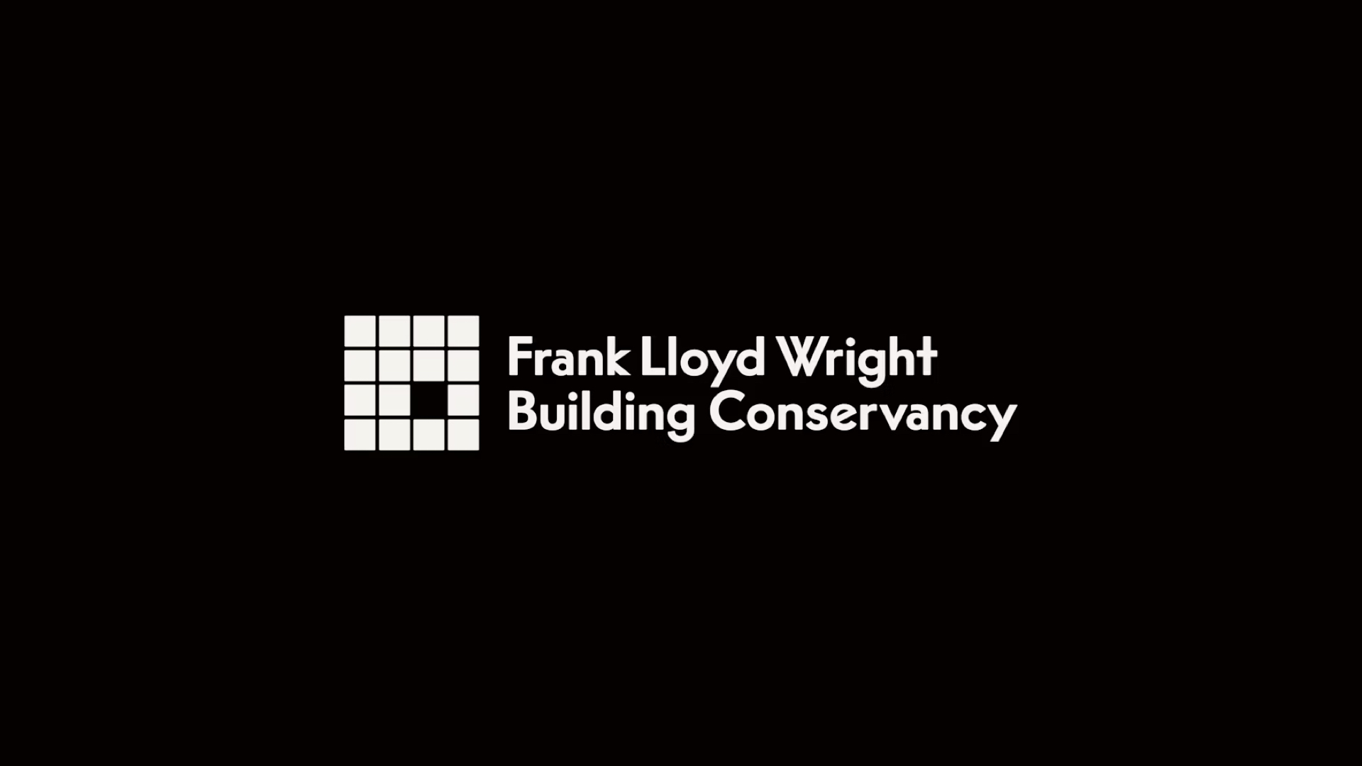
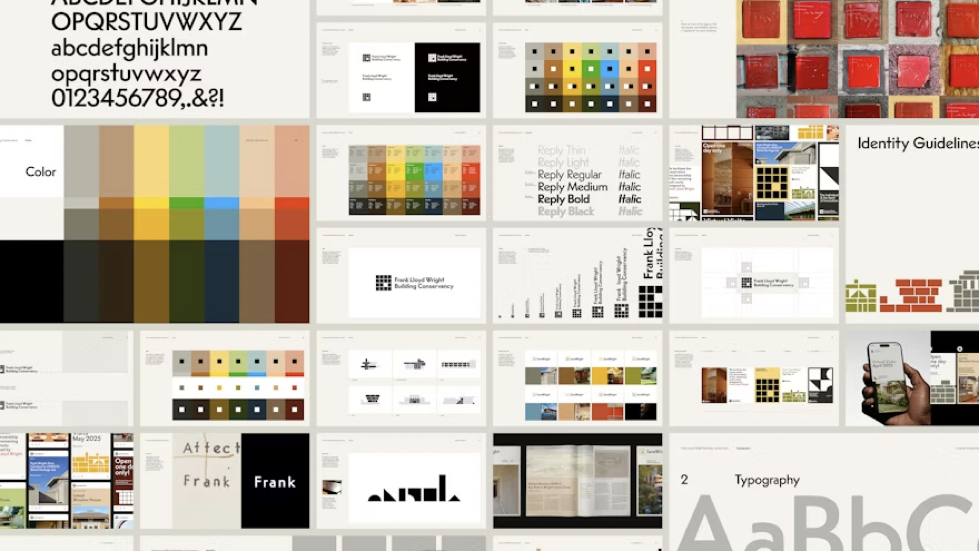
The Frank Lloyd Wright Building Conservancy recently unveiled a new brand identity, and at first glance, it seems almost deliberately... unremarkable. A square logo, conservative (though era-esque) typography, and muted colors that fade into the background.
But here's what makes this rebrand one we think is particularly beautiful: that's exactly the point.
In a recent conversation with Miles Seiden for the Brand Design Critique podcast, we unpacked a rebrand that challenges one of branding's core assumptions—that your identity should always stand out. Sometimes, the smartest move is to step back and let the work speak for itself.
Credits to Order and their incredible team for taking on such a project, and the Conservancy for working to maintain design history for all of us.
The Grid That Almost Wasn't
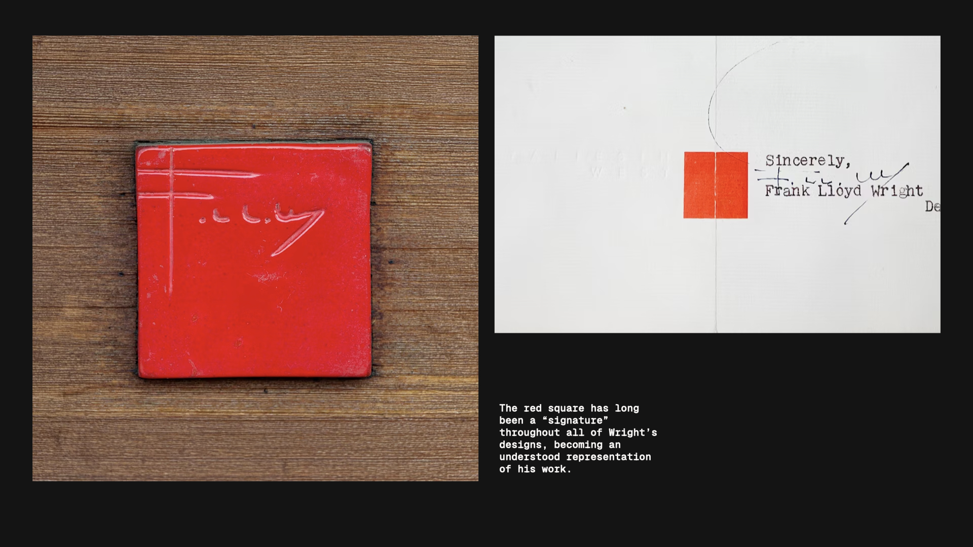
The Conservancy's new logo is built on a rigid grid—very calculated, very Swiss design system. But there's one element that breaks the pattern: a single square that steps out of alignment.
I see this square logo and it's much more rigid and calculated that I think Frank Lloyd Wright buildings feel. —Kaleb Dean
And that tension is real. Frank Lloyd Wright's architecture is famous for its organic integration with nature—flowing spaces that seem to grow out of their environments. So why wrap this in something that feels so... geometric?
Miles pointed out something crucial: "It should be focused on the buildings themselves. Like that's really the character of the whole thing."
And there it is. This isn't a brand trying to outshine the work. It's a brand designed to frame it.
Quirky Ligatures and Conscious Restraint
When we dug into the typography, things got more interesting. The Conservancy chose a typeface with unexpected ligatures—letters that connect in quirky, almost art deco ways. There's character hiding in those details.
But here's the thing: when they applied that typeface to the full brand system, they pulled back. The wordmark itself is relatively conservative. No excessive flourishes. No typographic gymnastics.
Maybe that is the idea behind the logo. Maybe don't want to get too quirky," Miles suggested. "Already having a grid with one thing out of it, you don't want to have too many what we call violators in the logo.
It's a masterclass in restraint. The design team gave themselves permission to add personality—just not at the expense of clarity or focus.
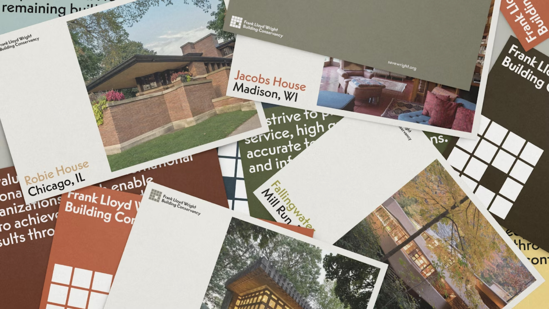
The Color Palette That Honors Legacy
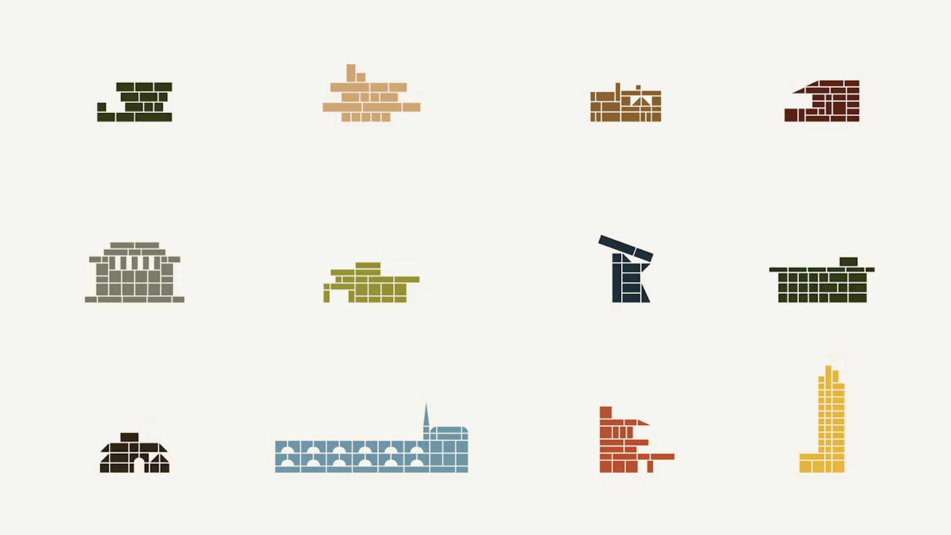
While many modern brands default to punchy, saturated color systems, the Frank Lloyd Wright Building Conservancy went the opposite direction: muted earth tones, ochres, soft greens, and flesh-toned beiges.
It's not that common that you see more muted tones, but that very much was in his buildings," Miles observed. "People don't go there because it's a tricky one to use, but used in the sense for the different buildings... it just has a nice variety to it."
These aren't random choices. They're colors pulled directly from Wright's architecture—the natural materials, the organic palettes he favored, the integration of built environments with their landscapes.
And they work precisely because they don't scream for attention.
Retro Type Specimens and Design Nostalgia
One of the unexpected delights in the brand guidelines? The inclusion of old-school type specimen presentations—the kind you'd find in vintage type books from the mid-20th century.
It's nice to have a nod back to that era of putting together type specimen books for people to look through," Miles noted.
These aren't just aesthetic throwbacks. They're deliberate connections to the era of craft, to the period when Wright himself was working. The design team is saying: we understand the legacy we're serving.
Anonymous Design as Strategy
By the end of our conversation, we'd both shifted our initial reactions. What started as a critique of blandness evolved into appreciation for strategic anonymity.
As something that downplays its presence and allows the building to go, it's successful in that regard," Miles concluded. "We're not here to take over. We don't need to over-brand this. We'll just let the buildings and the personality of that and the work that's already been done speak for itself.
And maybe that's the lesson here.
What Other Brands Can Learn from Frank Lloyd Wright Building Conservancy
Not every brand should fade into the background. But some should. Here are the key takeaways:
1. Know When to Step Back
If your brand exists to showcase something greater than itself—whether that's architecture, art, or ideas—your identity should support, not compete.
2. Restraint Can Be More Memorable Than Loudness
The quirky ligatures. The single offset square. The muted palette. These choices stick in your mind precisely because they're unexpected in their subtlety.
3. Heritage Doesn't Mean Replica
The Conservancy didn't try to recreate Wright's design language. They created a system that honors his principles—especially the idea that form should follow function.
4. Evolve Your Thinking
We changed our opinion midway through analyzing this rebrand. Good design should do that—reveal itself slowly, reward closer inspection, complicate initial assumptions.
The Quiet Power of Invisible Branding
In a world obsessed with bold brand statements and attention-grabbing identities, the Frank Lloyd WrightBuilding Conservancy rebrand is a refreshing counterpoint.
Yes, the logo is conservative. Yes, the colors are muted. Yes, the system feels deliberately understated.
But when your job is to honor one of America's greatest architects—someone whose work needs no embellishment—maybe the smartest brand move is knowing when to disappear.
We started off a little bit of a critique to the entry point into the brand itself," I reflected, "but as something that downplays its presence and allows the building to go, it's successful in that regard.
Sometimes the best brand is the one you barely notice—because you're too busy looking at what it's framing.