Utah 2034: When an Olympic Logo Arrives Before Its System
The Utah 2034 Winter Olympic Games brand has been circulating online— if nothing else, it’s accomplished one thing exceptionally well: it got people talking.
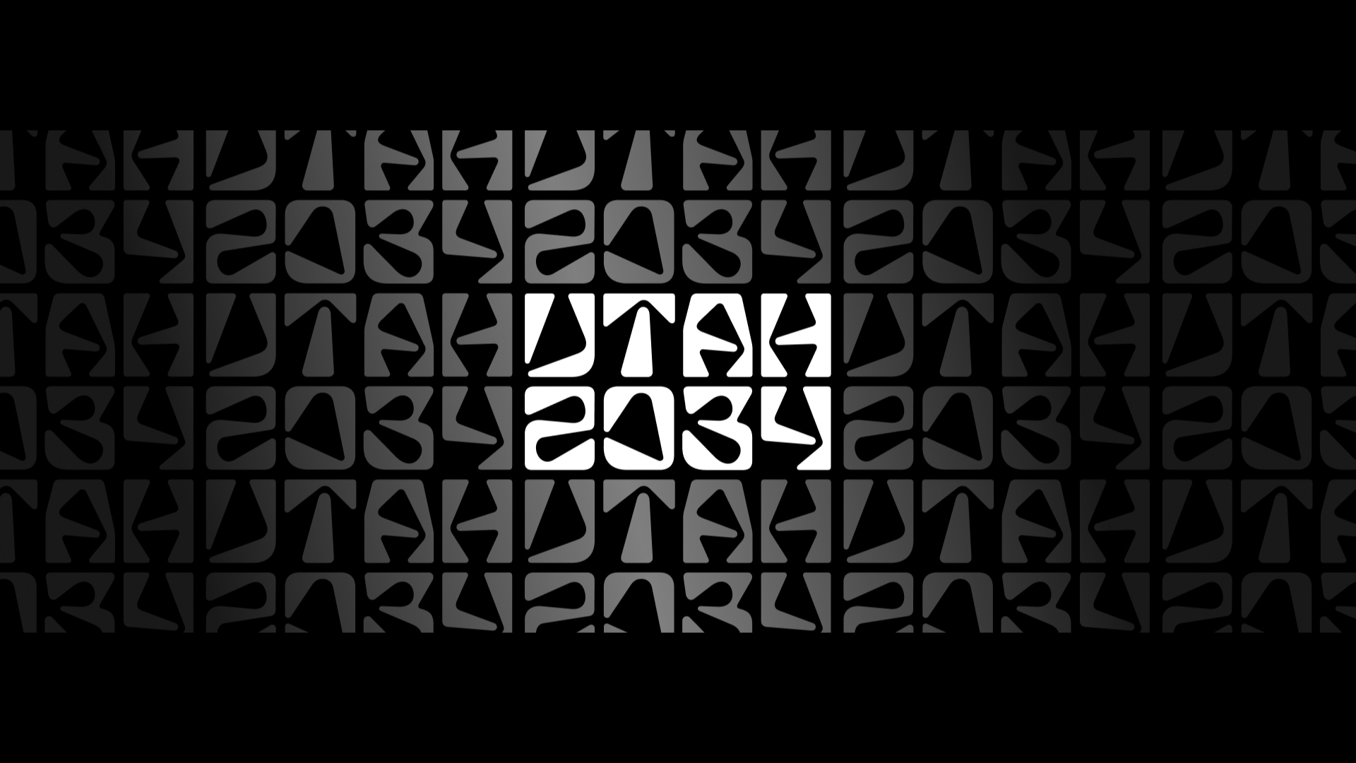
The first launch images—white letterforms floating on a stark black background with a gradient outlying grid—felt unexpected for an Olympic identity. Alien, even. It didn’t immediately read as celebratory, regional, or nostalgic in the way Olympic branding often does. But it did feel intentional, which made it worth paying attention to.
This article is adapted from a recent episode of the Brand Critique Podcast, where Kaleb sat down with designer Miles Seiden to unpack the Utah 2034 logo, its rollout, the backlash, and—more importantly—what’s missing right now: the system.
If you’d rather hear the unpolished conversation, the full episode is available on YouTube. What follows is the distilled, edited version of that discussion.
A Logo That Creates Friction—On Purpose?
Initial reactions were conflicted, or perhaps reserved. On one hand, the mark feels cold and abstract—far removed from the emotional shorthand typically associated with the Olympic Games. When most people think of Olympic identities, they think of strong pictograms, iconic symbols, and expressive systems that quickly communicate place, movement, and spirit. Utah 2034, at least in its current form, resists that expectation.
On the other hand, the logo does create friction—and friction isn’t inherently bad. It slowed people down during their doom-scrolling. It sparked conversation, and it made people ask questions. In a social media environment where most marks disappear in half a second, that alone is notable.
The hesitation comes from this: at the time of recording and writing, the logo reads less like a complete identity and more like the opening note of one.
The Risk of a Logo-First Launch
One of the biggest challenges with the Utah 2034 rollout is timing—its massively early, and yet still underdeveloped.
What we’re seeing is a logo presented largely in isolation, without the broader visual language that would help contextualize it. That’s a risky move, especially for something as emotionally charged and globally visible as the Olympics.
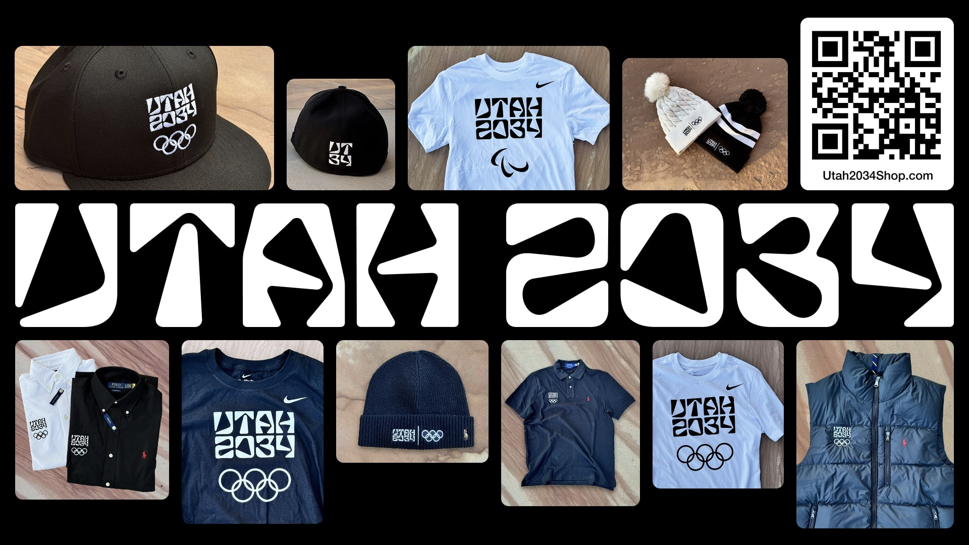
Other brands have done this before in recent history. Logo-first launches often struggle because audiences are asked to judge a fragment instead of a whole. Without seeing how the mark lives on tickets, signage, apparel, wayfinding, digital interfaces, or athlete materials, people fill in the gaps themselves—and usually not generously.
Plus, The Olympics don’t lack hype. They don’t need a nine-year runway to build awareness. Which makes this early, partial reveal feel strangely premature given its underdevelopment.
Why “Utah” Instead of “Salt Lake City”?
Historically, Olympic Games are tied to cities. Salt Lake City has precedent, recognition, and Olympic history. Utah, by contrast, is vast, varied, and difficult to visually summarize in a single gesture.
From a branding standpoint, “Utah 2034” introduces immediate tension. Utah’s landscapes are famously diverse—mountains, deserts, red rock, snow, canyons. Trying to represent the entire state risks flattening those differences rather than celebrating them.
Admittedly, T=there may be strategic reasons for the choice. Things like SEO, statewide pride, or venue distribution come to mind as a brand builder, but visually, it complicates the task. A logo can’t realistically carry that much geographic meaning on its own, which may explain why the identity leans abstract rather than illustrative.
Legibility vs. Readability at Olympic Scale
The Utah 2034 wordmark is legible—you can decipher what it says. But it’s not immediately readable in the way signage often needs to be. That’s not necessarily a flaw but it is a tradeoff.
Design that’s too easy to read is often forgotten just as quickly. Design that’s too hard to read becomes a failure. Olympic branding has to live somewhere in the middle—memorable enough to stick, but clear enough to guide millions of people through physical space.
Right now, Utah 2034 sits in that middle zone. It takes a second longer to process, which may help it embed itself in memory—but only if the surrounding system supports it.
Committee Design and the Weight of Consensus
It’s impossible to talk about Olympic branding without talking about committees.
Unlike commercial brand work where a single creative director or small team can protect a vision, Olympic identities move through layers of approval: city officials, state representatives, Olympic committees, Paralympic committees, international bodies, sponsors, and more.
That process tends to smooth out extremes. Bold ideas survive only if they’re flexible enough to withstand compromise. In that context, the Utah 2034 logo is actually surprisingly assertive.
But committee-driven design also explains why this feels unresolved. Logos often emerge first because they’re easier to approve. Systems take longer. They require trust, alignment, and a shared understanding of how the identity will live in the world.
Hints of a Stronger System Beneath the Surface
Where things start to get more interesting is in the motion work and environmental cues.
The launch video hints at topographic influences—streams, slopes, paths, and contours that echo Utah’s geography without literal depiction. Those moments feel more alive, more human, and more connected to place than the static logo alone. This is where the identity could succeed or fail.
If those organic cues evolve into a full system—pictograms, wayfinding, environmental graphics, apparel, and storytelling—the abstract logo may start to make sense as an anchor rather than a destination.
Without that system, it risks remaining an aesthetic curiosity.
Backlash Is Inevitable—Context Matters
Public backlash was swift, especially from Utah residents who felt the logo didn’t reflect the beauty or character of the place they love. That response is understandable—and also expected.
The Olympics are a global event, but they’re hosted locally. Tension between local identity and global abstraction is unavoidable. Add the internet’s tendency toward instant judgment, and every Olympic logo becomes an open-source critique overnight.
The key question isn’t whether people dislike it now. It’s whether, over time, the system earns trust.
Final Take: A Brand Still in Draft Mode
The brand need patience.
Right now, Utah 2034 feels like a logo without its language. A symbol waiting for context. A system that hasn’t fully introduced itself yet.
There’s real potential here. The typography, abstraction, and origin hints suggest a thoughtful direction. But Olympic branding isn’t about the one-off logo. Rather, it’s about meaning, movement, and memory at massive scale. It's also about snowboarding and some insane winter sports.
Until we see the full system, any final judgment would be premature.
This is one worth revisiting. See you all in 2034.